Not so long ago, I got a memo from the head of IKEA communications introducing me to this "brand-new" "absolutely amazing" font that we'd all "grow to love and appreciate." Little did I know that I'd be scrolling through this seemingly never ending email for over an hour to find a single rock solid reason for why a multi-billion dollar company would jump into a trend of dumping design in favor of "simplicity." My search came up empty, as did my heart ... that was the day I realized this was the beginning of an era in favor of off the shelf, anyone-can-do-it, kit design. It was 2010 and IKEA had just thrown IKEA-SANS to the grave in favor of ... Verdana.

IKEA-SANS was a beautifully crafted custom font, which included a whole slew of glyphs and symbols. It could be seen across all print and digital material... including in-store navigation vinyl signs, banners, outdoor billboard ads... tv ads ... you name it. It had foundations borrowed from Futura, a beautiful font with a light, bold, extra bold, extra condensed variants... basically it could be used for anything and everything. The only place it didn't show up, was the IKEA-USA.com website. Now keep in mind, back in 2008 when the site was originally conceived, Verdana was one a just a few fonts that worked in all browsers on all devices. In order to create "consistency across all media," IKEA dumped the revered for the simple. The rest is history, or so I thought.
Fast forward a few years and this trend has grown into a type of cancer inflicting it's destruction across brands of all shapes and kinds and even application design. This time it wasn't technology as the driving factor in "constancy" but a TREND caused by some pretty big players. Apple did it with anti-Skeuomorphism, Google did it with the sans-serif ... Verizon did it with a very tiny check mark.
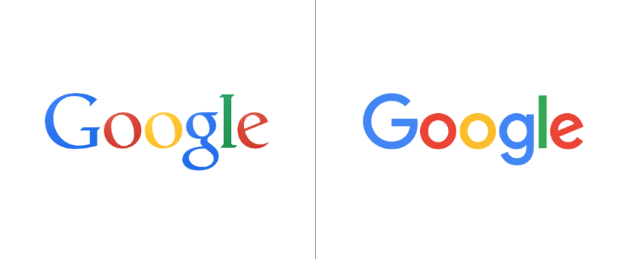


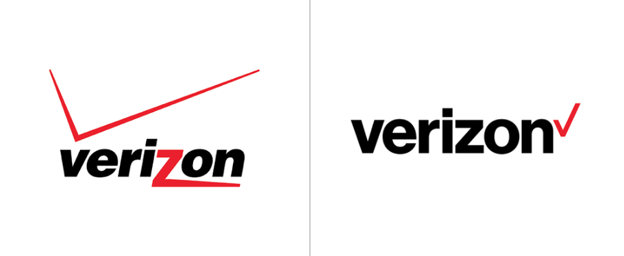
All of these brands take something that was entirely unique, full of brand history and recognition, and simplify, simplify... simplify... Many argue that these logo updates speak about the future of the company because it portrays "friendliness" or "diversity" or "approachability" or whatever their PR team was able to cough out after 20 cups of coffee at 4am the night before the big reveal. My thought is that once they saw a big player jump on board, their natural instinct was to follow... because it's easy to follow.
The truth is, it's super painful to stand on your own when all others are following a completely different trend. It just feels wrong. My advice: don't fall victim to over simplification. Just because others are doing it, doesn't make it right. Don't pick a font or colors or imagery just because others are... find the right balance between your needs and the needs of your customer to tell your unique brand story. Avoid UI kits at all costs - chances are all your competitors are probably using the same exact pieces to put together their very own products. Don't pick what is easiest, pick what is hard - what is right. I guarantee, if you did what was difficult but what was right, eventually everyone else will begin to follow you. And that my friends, kicks Verdana's ass any day.