Flat design continues to rob the world of flavor and authenticity. A rapacious trend that swallows serif fonts, textures, seasoning... a giant gulp and all tradition out the window.
There was once a time (not that long ago) where a company would design their identity package with such care (and a lot of money) hiring the best in the world to do it... and they'd stick with this identity for a LONG time. The thought was if your brand was strong and recognizable that people would trust that the product was the same, no matter where they bought it, and that they'd remember you and probably buy your products again and again.
What's up with the industry? Why are we seeing all the biggest players throwing out calculated "tried and true" identity packages for (seemingly) underdeveloped ideas? Even worse, we are seeing BRAND NEW companies, literally under 6 years old, already rebranding and reimagining themselves. In this blog post I will share McDonald's most recent rediscovery of identity (and of course, my opinions).
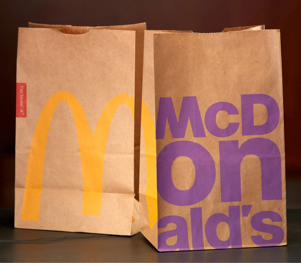
All new packaging
First of all, it's important to note that McDonald's has been in trouble for a while now. The last few years of the recession were not friendly to this fast-food beast that once touted how successful they were. There was once a time when buying into this juggernaut was considered fail-proof. McDonald's with it's ever growing reach into new markets like China and the rest of Asia boasted culturally diverse menus and great margins.
Rebranding is nothing new. McDonalds has done this for decades... with much success.
Fast forward to today and we have a very different company. During the recession, not only did the consumer become more frugal but also health conscious. McDonalds had to reinvent themselves several times, introducing healthier items and all-day breakfast to compete with chains like Starbucks and the like. Margins have dropped for franchise owners and excitement for the brand has fizzled.
Part of efforts to reenergize, McDonalds redesigned packaging, advertising spots, the company website and store-front messages. In almost a brand repositioning, McDonalds has aimed to elevate the brand by modeling the food with high-fashion type photography. Very odd choice but I guess this is an attempt to persuade patrons that eating at McDonalds can be a better, healthier experience then before... choking on my words.
We wants it. We needs it. We must have the precious!
For a second I'll entertain that idea. Maybe ordering a Big Mac, sans-serif, sans-mostly-the-entire-burger... The bags are positioned almost like high fashion pieces themselves. Hats and shoes made from the patterns dress the product models. But at least all the packaging is 100% recycled now! :\
Where can I get me some Big Mac heels?
Who they kidding? One bite of that burger and that girl would't fit in that size 0 anymore...
Huge fonts adorn recycled packaging, in big blocky lettering wrapping sometimes multiple lines. The golden arches are solemn used, replaced by the name of whatever you are consuming... in the example above, a girl holds onto a "Big Mac" box. If you order breakfast, the bag screams "EGG MCMUFFIN" in massive red text. RED RUM... REEEDDDD RUUUUMMMMM. This is super flat design, folks. No pictures of products on any of the materials. Just the uncoated material of the bag itself, against a bold, single color.
Overall, I think the brand refresh is successful. It has a very simple, elegant look about it... even with the high fashion weirdness. But I am not sure that consumers will have any change in impression about a brand once known only for cheap fast food realness. Are you Lovin' it?
I'll leave this here just for you.........